

History of BART system map explained in new podcast
OAKLAND, Calif. (BCN/KTVU) - Any cartography nerds or train fans who might be interested in the history of the BART system map are in luck.
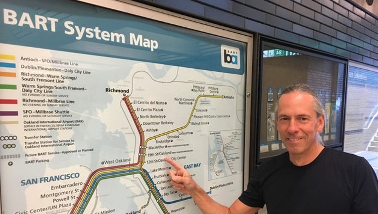
A podcast posted on the BART website Thursday delves into the inception and evolution of the transit agency's map, touching on the original design, its 1990s-era changes and the current iteration that adorns trains and stations throughout the Bay Area.
The podcast is part of BART's regular series "Hidden Track: Stories from BART" and runs about 30 minutes.
In it, the aptly named Bart Wright, a designer and mapping expert who has been helping revamp the BART map over the last two decades, regales listeners with the story of the iconic image.
Wright notes that the map didn't change for the first 20 years of the transit agency's life since, for one, it required a lot of effort to revise it during a time when the technology to do so was less nimble.
"Also, the system didn't change for 20 years," Wright said.
"It was built, that was a huge endeavor and then it was 20 years of relatively nothing within the system that changed."
Then in the 1990s, the system experienced a wave of changes and expansions that required a new map that could hold a lot of new information, including BART's connections to other transit agencies.
"There was a recognition that BART was going to go to (San Francisco International Airport), there was also recognition there's going to be a whole new line going out to Dublin-Pleasanton," Wright said.
"I think the map was part of the idea of making this more geographical map was to educate people about what was going to happen, where BART was going."
That map lasted from 1995 until about 2010, when it was again time for a change.
"There's the mid-90s, early 2000s map and then (the) current map, all the transit that's on that '95 map is on this map as well, but in a much more simplified schematic approach," Wright said.
For more information, visit BART's website.